- Feb 21
Winter Bloom Palette -Colour Inspiration
- Karen Jaroudi
- Colour Inspiration
- 0 comments
This palette captures a quiet, powerful contrast: a rose in winter. It blends warmth and restraint, softness and strength.
At its heart is deep wine burgundy, grounding the palette with maturity and depth. Dusty winter blue introduces calm and clarity, while rose red and soft coral bring gentle vitality, life still blooming beneath the frost. Finally, creamy pale gold softens everything, like winter light resting on petals.
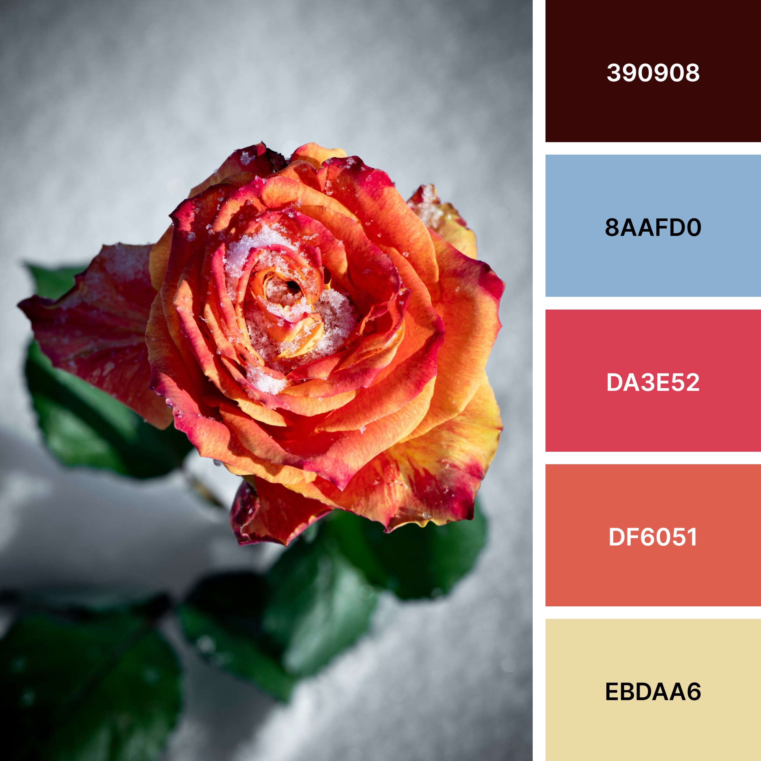
Deep Winter Burgundy (#390908) - This is the anchor of the palette. A rich, wine-toned burgundy that feels grounded, mature, and quietly powerful. It evokes depth, wisdom, and inner strength. This colour represents confidence without display, warmth without excess.
Soft Winter Blue (#8AAFD0) - This blue feels calm and airy. It offers a balance to the warmth of the reds. Gentle rather than cold, it softens edges and creates space, inviting reflection, ease, and quiet confidence.
Bloomed Rose Red (#DA3E52) - This is the heart of the flower. Bold yet refined, this red carries passion, femininity, and vitality without feeling overpowering.
Soft Coral Ember (#DF6051) - A warmer, softer extension of the rose red, this coral feels nurturing and human. This colour brings movement and softness, creating harmony between boldness and calm.
Winter Light Cream (#EBDAA6) - This pale, golden cream is the quiet glow of winter light. Subtle and luminous, it brings softness, openness, and refinement to the palette. It acts as a gentle neutral, lifting and balancing the deeper tones.
How to Use This Palette in Your Home
Design spaces that feel grounded, elegant, and quietly alive.
Use deep burgundy sparingly but intentionally: an accent chair, velvet cushions, artwork, or a statement vase. This colour adds emotional richness and sophistication, perfect for living rooms or reading corners.
Winter blue works beautifully on walls, cabinetry, or soft furnishings. It brings balance and mental clarity, ideal for bedrooms, offices, or transitional spaces.
Introduce rose red and coral through textiles: throws, pillows, ceramics, florals, or art. These tones should add life and softness.
Creamy pale gold belongs in lighting, frames, trays, mirrors, and subtle metallics. It reflects warmth and elevates the space without shouting.
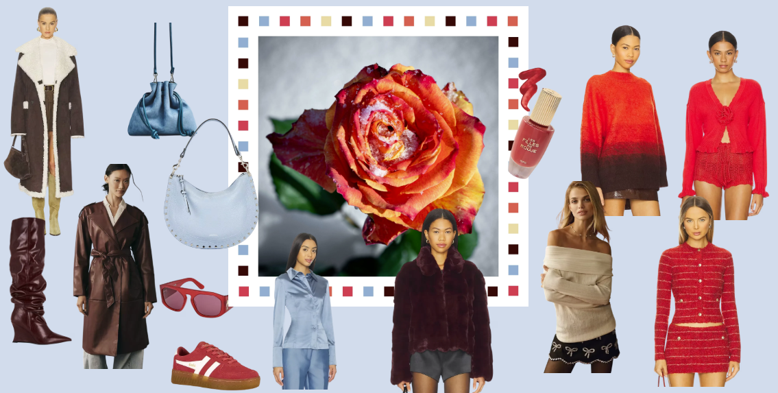
How to Wear This Palette in Your Wardrobe
Style that feels confident, calm, and quietly expressive.
Burgundy knits, trousers, coats, or leather accessories act as your grounding base. This shade replaces harsh black while still feeling strong and polished.
Winter blue works beautifully in blouses, tailoring, scarves, or knitwear. It softens the overall look and brings light near the face.
Rose red or coral are perfect for tops, dresses, silk scarves, or subtle prints. These shades flatter mature skin and add vitality without being loud.
Pale gold and cream shine in accessories: jewellery, belts, shoes, and handbags. They elevate the outfit and tie everything together effortlessly.
Use the Refine by Design Style Formula:
One grounding piece + one soft neutral + one warm accent + refined accessories
Like a rose in winter, this colour palette reminds us that refinement is not about hiding, but about knowing when and how to stand out.
Check out the shopping Guide inspired by this palette: