- Jan 17
Northern Stillness-Colour Inspiration
- Karen Jaroudi
- Colour Inspiration
- 0 comments
This palette was inspired by a stunning photo by Vincent Guth. It evokes the wonder of standing under the aurora borealis, quietly powerful, expansive, and deeply soothing. The design beautifully combines cool clarity with grounded depth, creating a look that's both dreamy and inviting.
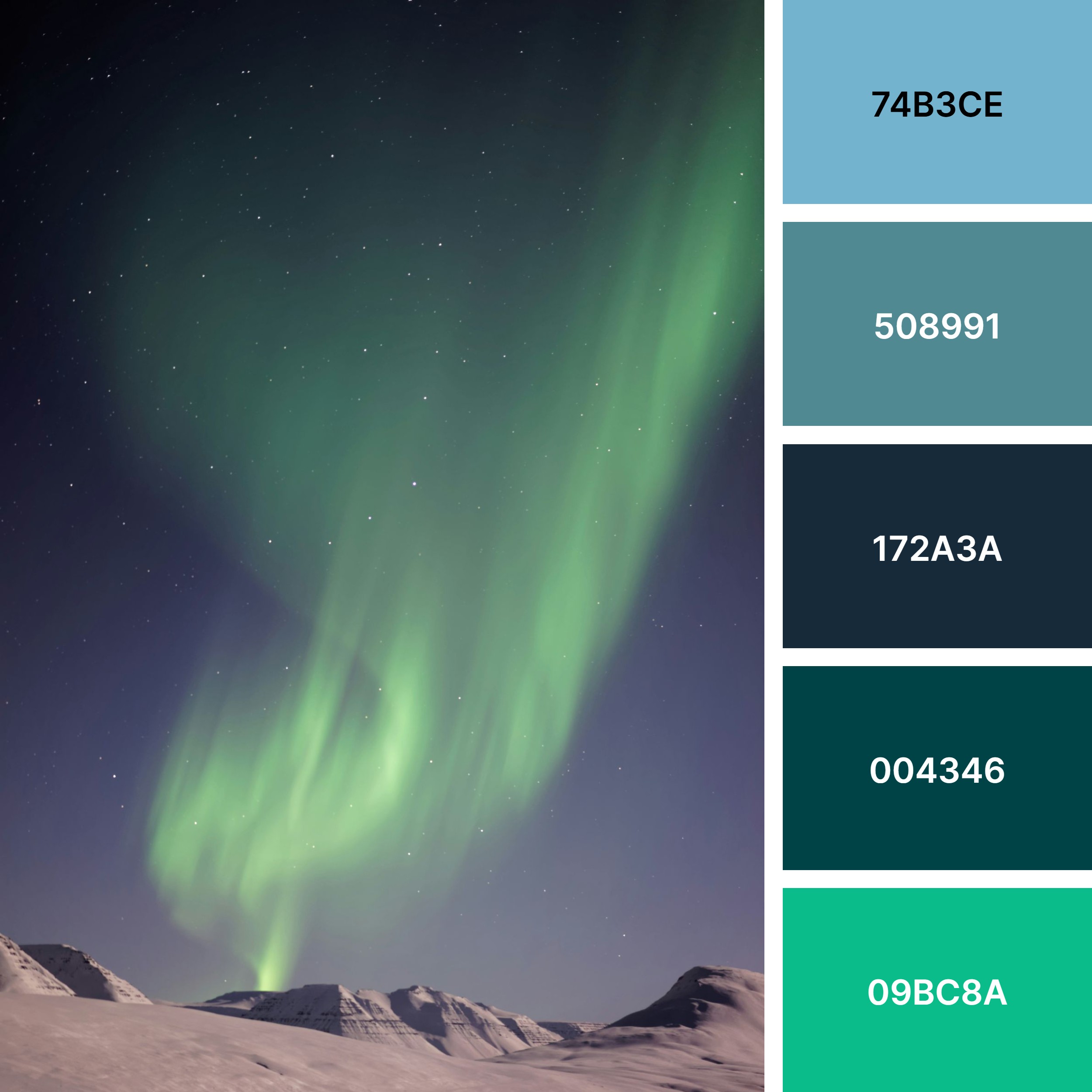
Palette Essence: Northern Stillness
A conversation between night sky, frozen land, and luminous light.
Soft Sky Blue (#74B3CE) airy, open, and reflective
Muted Teal (#508991) steady, grounding, quietly confident
Deep Midnight Blue (#172A3A) anchoring, elegant, timeless
Dark Pine Teal (#004346) cocooning, restorative, rich
Aurora Green (#09BC8A) fresh energy, movement, subtle vitality
Together, these hues evoke a sense of calm motion, like light dancing slowly across a winter sky.
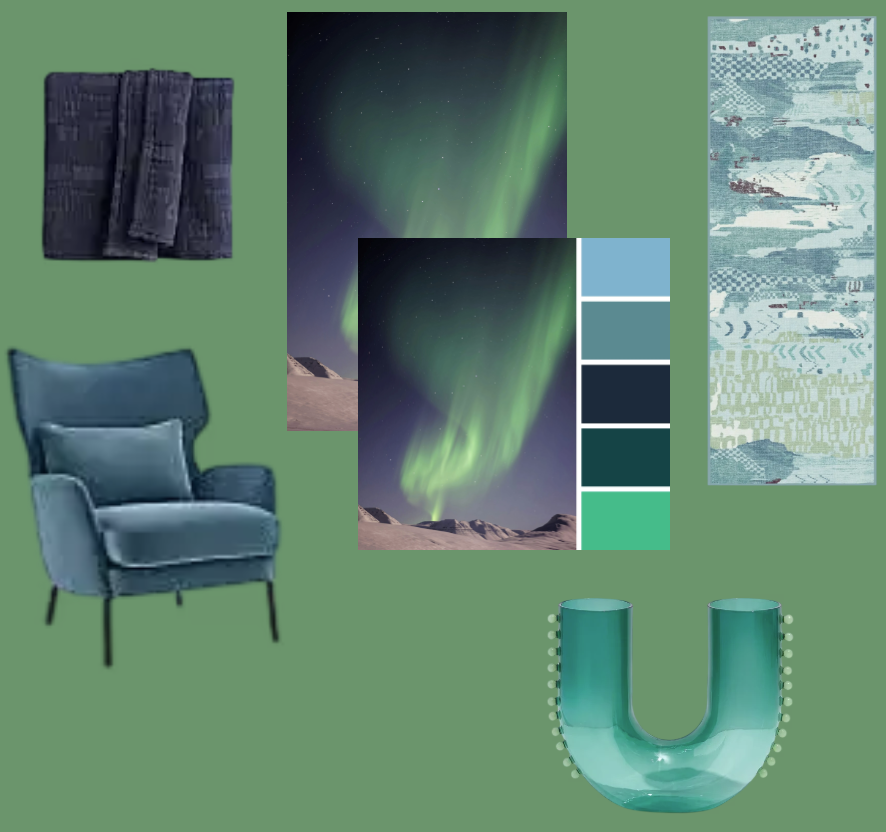
How to Use This Palette at Home
1. Create a Calm Foundation
Use Deep Midnight Blue or Dark Pine Teal on an accent wall, built-ins, or lower cabinetry. Pair with warm whites, soft stone, or light wood to keep the space balanced and refined.
2. Layer Softness & Light
Introduce Soft Sky Blue through walls, bedding, or large textiles to open up bedrooms and living spaces. Think linen curtains, upholstered headboards, or a painted ceiling for a subtle statement.
3. Add Depth with Intention
Muted Teal works beautifully on furniture pieces, sideboards, armchairs, or kitchen islands. It grounds the palette without feeling heavy.
4. Use Aurora Green as an Accent
Bring it in through cushions, art, vases, throws, or plants. This is your “light in motion” colour, best used sparingly for visual energy.
5. Finish with Texture
Matte ceramics, brushed brass, wool, boucle, glass, and natural stone elevate the cool tones and add warmth.
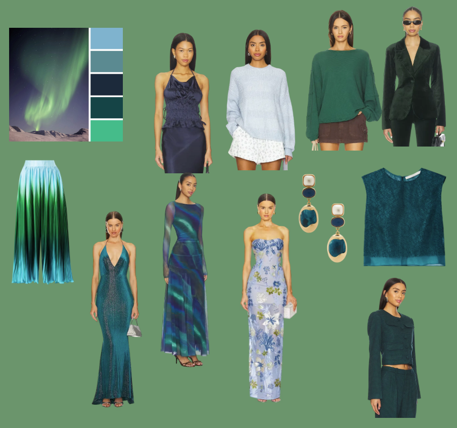
How to Use This Palette in Your Wardrobe
1. Build a Refined Base
Midnight Blue and Dark Teal are stunning neutrals for trousers, blazers, coats, and knitwear. They flatter mature skin tones and feel softer than black while remaining polished.
2. Add Light Near the Face
Soft Sky Blue in blouses, scarves, or sweaters brightens the complexion and feels effortlessly elegant. Ideal for daytime looks and relaxed tailoring.
3. Use Muted Teal for Everyday Sophistication
Dresses, cardigans, silk tops, or wide-leg pants in this tone feel modern yet timeless. Easy to mix with denim, cream, grey, or navy.
4. Accent with Aurora Green
Jewelry, handbags, shoes, belts, or a statement scarf. This colour brings freshness and confidence without overpowering your look.
5. Fabric Matters
These hues shine in silk, cashmere, wool, satin, and fine knits, materials that allow depth and movement, much like the northern lights themselves.
This palette supports a lifestyle of quiet confidence, clarity, and inner calm.
It’s ideal for women who want their home and wardrobe to feel intentional, soothing, and elevated.
Karen
Check out this free shopping guide inspired by this Palette.