- Sep 19
Moody and Grounded Palette
- Karen Jaroudi
- Colour Inspiration
- 0 comments

This palette feels moody, grounded, sophisticated, and quietly dramatic. It captures that transitional moment between late summer and fall, the heat of the illuminated clouds against the fresh depth of the evening sky. Rather than depending on traditional autumn oranges and browns, it creates a more refined fall story through muted warmth, smoky blues, and deep wine tones.
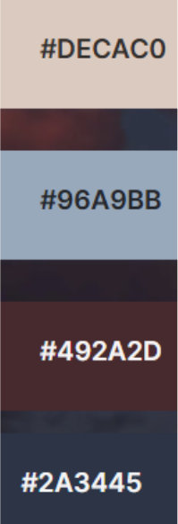
The four colours work especially well together because they balance softness with structure:
#DECAC0: Soft Blush Taupe: a warm, creamy neutral with a hint of rose. Elegant and calming rather than stark.
#96A9BB: Misty Blue: a muted blue-grey that brings airiness and softness to the darker shades.
#492A2D: Deep Merlot: a rich brown-burgundy that adds warmth, intimacy, and a distinctly autumnal feeling.
#2A3445: Midnight Slate: a deep blue-charcoal that grounds everything and provides a sophisticated alternative to black.
In Your Wardrobe
Think of Midnight Slate as the foundation. It looks beautiful in fitted trousers, a wool coat, a blazer, dark denim, a structured handbag, or a knit dress. It has the versatility of navy but feels slightly more modern and unexpected.
Bring in Soft Blush Taupe close to the face through silk blouses, fine-knit sweaters, scarves, or a beautiful trench. It softens the deeper colours and adds understated femininity without becoming overly sweet.
Misty Blue is your transitional shade. Try it in a cashmere sweater, lightweight knit, scarf, or relaxed pants. It creates a particularly polished tonal combination.
Then use Deep Merlot for richness: a suede bag, leather loafers, a belt, a knit sweater, lipstick, a manicure, or a statement coat. A little merlot against blush taupe or misty blue immediately makes an outfit feel more intentional.
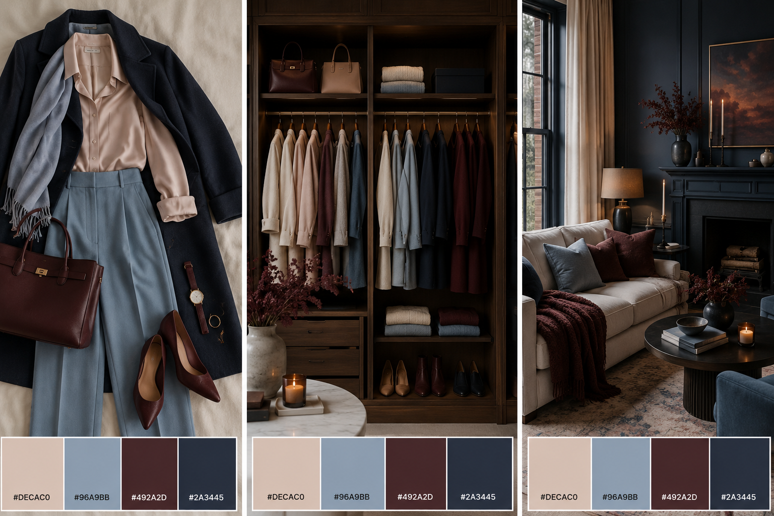
In Your Home
For interiors, reverse the proportions: let the lighter shades create the atmosphere, and use the darker colours to provide definition.
Soft Blush Taupe could become a warm neutral backdrop through walls, linen curtains, an upholstered chair, bedding, or a large area rug. It adds warmth without the heaviness of beige.
Misty Blue works beautifully in textiles, velvet cushions, throws, bedding, ceramics, or even cabinetry. It introduces colour while still behaving almost like a neutral.
Then layer in Deep Merlot sparingly. Think velvet pillows, an accent chair, artwork, books, autumn branches, pottery, or a beautiful throw. This shade gives the room its emotional warmth.
Finally, Midnight Slate provides structure through furniture, picture frames, lamps, cabinetry, hardware, or a dramatic feature wall. It anchors the softer colours and keeps the palette from becoming overly delicate.
The overall effect is a home and wardrobe that feels collected rather than decorated, feminine without being precious, and seasonal without relying on obvious fall colours. It feels especially fitting for September: a palette that moves from softness into structure while keeping warmth at the centre.